
Equipment maintenance DX by sensor data × data analysis
Part 3: Data Analysis for Achieving Predictive Maintenance - Method Using the Normal Distribution (2)
3. Practical Application of Hotelling's T-squared Method - Verification Using Artificial Data
This section demonstrates the flow for outlier detection and anomaly detection using artificial data with the goal of making it easier to visualize how to use Hotelling's T-squared method. Since some parts of the implementation flow correspond to Steps 2 through 4 of "2. How to Proceed with Data Analysis in Predictive Maintenance," that notation is followed here.
3.1 Artificial Data to be Used and Anomaly Observation and Classification (Steps 2 and 3)
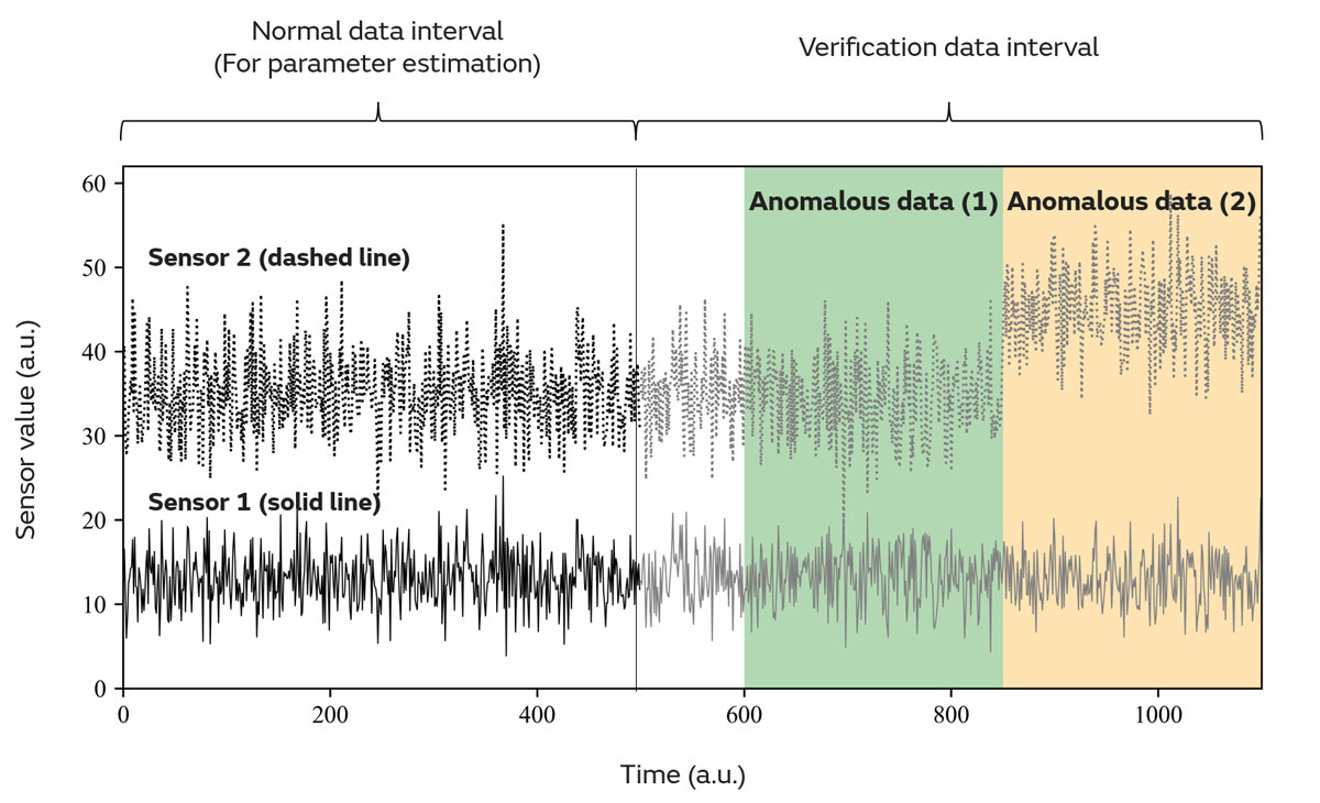
Figure 8 shows the time-series plots of artificial data simulating two types of sensors (Sensors 1 and 2) used in the verification. The first half of the data consists of normal data, while the second half is treated as verification data containing anomalies. Two anomaly patterns have been prepared (Anomalous Data (1): green, Anomalous Data (2): orange). Because the artificial data is based on random numbers generated from a normal distribution, it is assumed that the data follows a normal distribution for the purposes of this discussion.
If we classify the anomalies according to Steps 2 and 3, we can see that Anomalous Data (2) seems to be accompanied by drift, particularly in the values of Sensor 2. On this plot alone, it is difficult to recognize Anomalous Data (1) as an anomaly. For now, let us consider the application of Hotelling's T-squared method in the form of anomaly detection. In the following sections, Hotelling's T-squared method using one-dimensional and multidimensional normal distributions will be referred to as one-dimensional and multidimensional Hotelling's T-squared methods, respectively.
3.2 Method Application and Result Evaluation (Step 4)
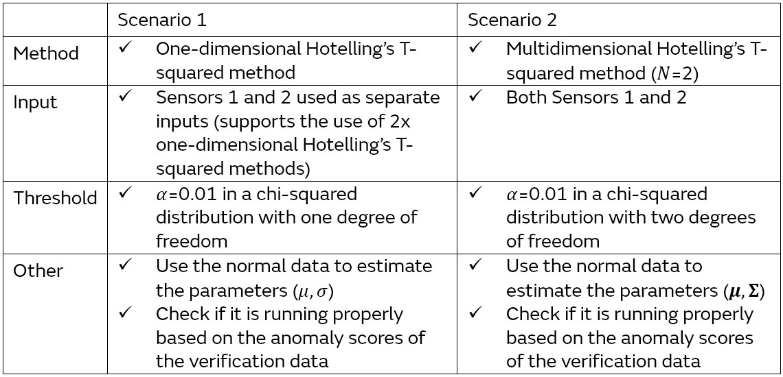
To confirm the differences between the one-dimensional and multidimensional (𝑁=2) Hotelling's T-squared methods in this case, we verified scenarios with the following two patterns (Table 2). Figure 9 shows the results for each scenario.
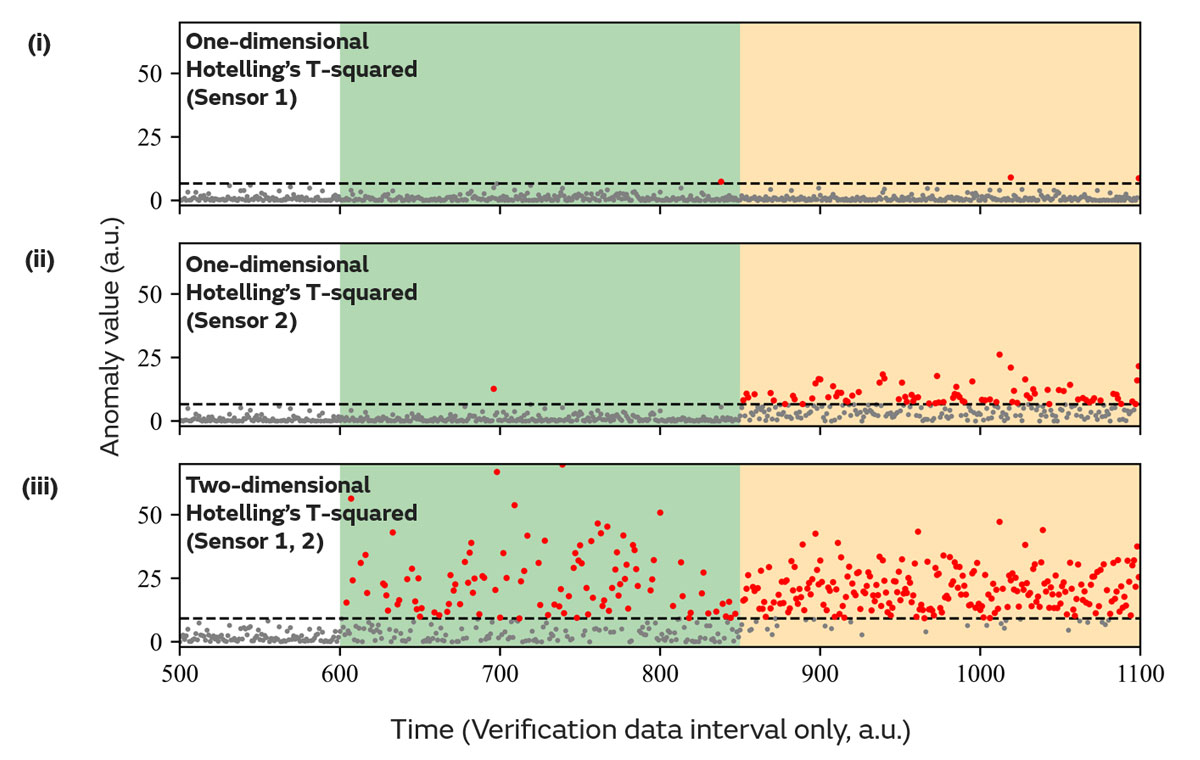
Upon viewing the results of Scenario 1 (Figure 9-(i) & (ii)), absolutely no anomalies were detected in Anomalous Data (1). Regarding Anomalous Data (2), while some parts of the data were correctly identified as anomalous on the Sensor 2 side, most data points were not. On the other hand, if we look at the results for Scenario 2 (Figure 9-(iii)), a significantly larger number of data points were correctly identified as anomalous compared to Scenario 1 for both Anomalous Data (1) and (2). In particular, almost all of the data points were successfully identified as anomalous in Anomalous Data (2). Based on this comparison, we can see that the Hotelling's T-squared method, which assumes a multidimensional normal distribution, is superior.
At the end of this article, we would like to explain the reasons behind the significant difference in performance between Scenario 1 and Scenario 2. This point can be clearly verified by looking at the threshold and anomaly determination range for each scenario on the scatter diagram plot of Sensor Data 1 and 2 (Figure 10).
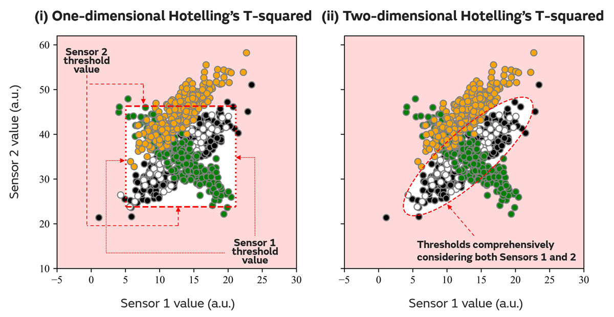
The scatter diagram shows that the values of Sensor 1 and Sensor 2 have a positive correlation*6 in the normal data (black). On the other hand, Anomalous Data (1) (green) shows a negative correlation despite having the same range of sensor values as the normal data, and Anomalous Data (2) (orange) shows a positive correlation with the Sensor 2 values shifted slightly higher than the normal data. In both cases, we see behavior that deviates from the normal data.
Please note the threshold ranges for Scenarios 1 and 2. In Scenario 2, the threshold range forms an elliptical shape around the normal data (white background in Figure 10-(ii)). This is because the multidimensional Hotelling's T-squared method effectively incorporates the correlation between Sensor 1 and Sensor 2 (Figure 5-(ii) & (iii) - Section 2.2 of Part 3 (1)). Therefore, it is possible to properly identify Anomalous Data (1) with its different correlation and Anomalous Data (2) with its shifted Sensor 2 values as anomalies (red background in Figure 10-(ii)).
Scenario 1 stands in contrast to this result (Figure 10-(i)). In the one-dimensional Hotelling's T-squared method of Scenario 1, the correlation structure between the data is not considered at all, because Sensors 1 and 2 are treated as separate inputs. Anomalies are determined only on the allowable range of each individual sensor value (white background in Figure 10-(i)). As a result, anomalies cannot be identified at all for Anomalous Data (1) in particular, where the sensor values fall into the same range.
*6 One concept that represents the relationships and regularity between data. If one numerical value increases as the other increases, it is called a "positive correlation." However, if it decreases as the other increases, it is called a "negative correlation."
4. Conclusion
In this article, we covered the definition of anomaly scores and the mechanism of anomaly determination followed by an explanation of the theory and practical application of Hotelling's T-squared method. Due to the scattered use of mathematical equations, it may be difficult to understand everything in one go. However, we hope that you were able to understand the overview and mechanism of Hotelling's T-squared method through the specific examples.
While this is not limited to anomaly detection, it is important to understand the mechanism when using data analysis methods to be able to select the appropriate method for your own needs. It may take some time and effort to understand this mechanism, and we hope that you will reread this article to deepen your understanding of Hotelling's T-squared method.
[Supplemental] Definitions and Notation Related to Mathematical Formulas
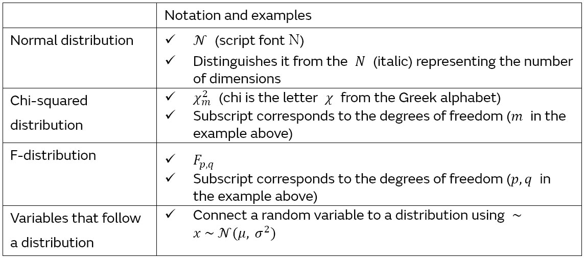
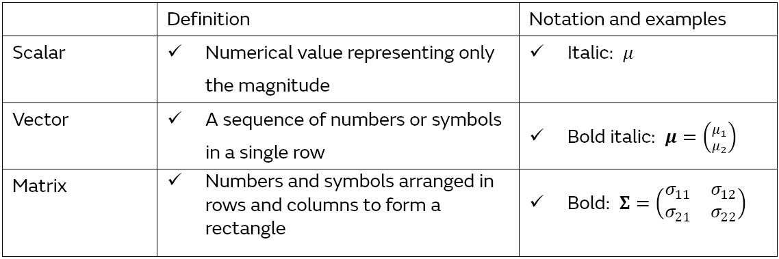
In working with mathematical formulas, it is necessary to deal with scalars, vectors, and matrices. Their definitions and notations are summarized in Table 3. In particular, notations related to vectors, matrices, and their operations are summarized in Table 4. Furthermore, notations related to probability distributions are listed in Table 5.
(Readers interested in the mathematical details of the table contents or the details and definitions of the metrics appearing in the text are encouraged to refer to textbooks on linear algebra and statistics, etc.)
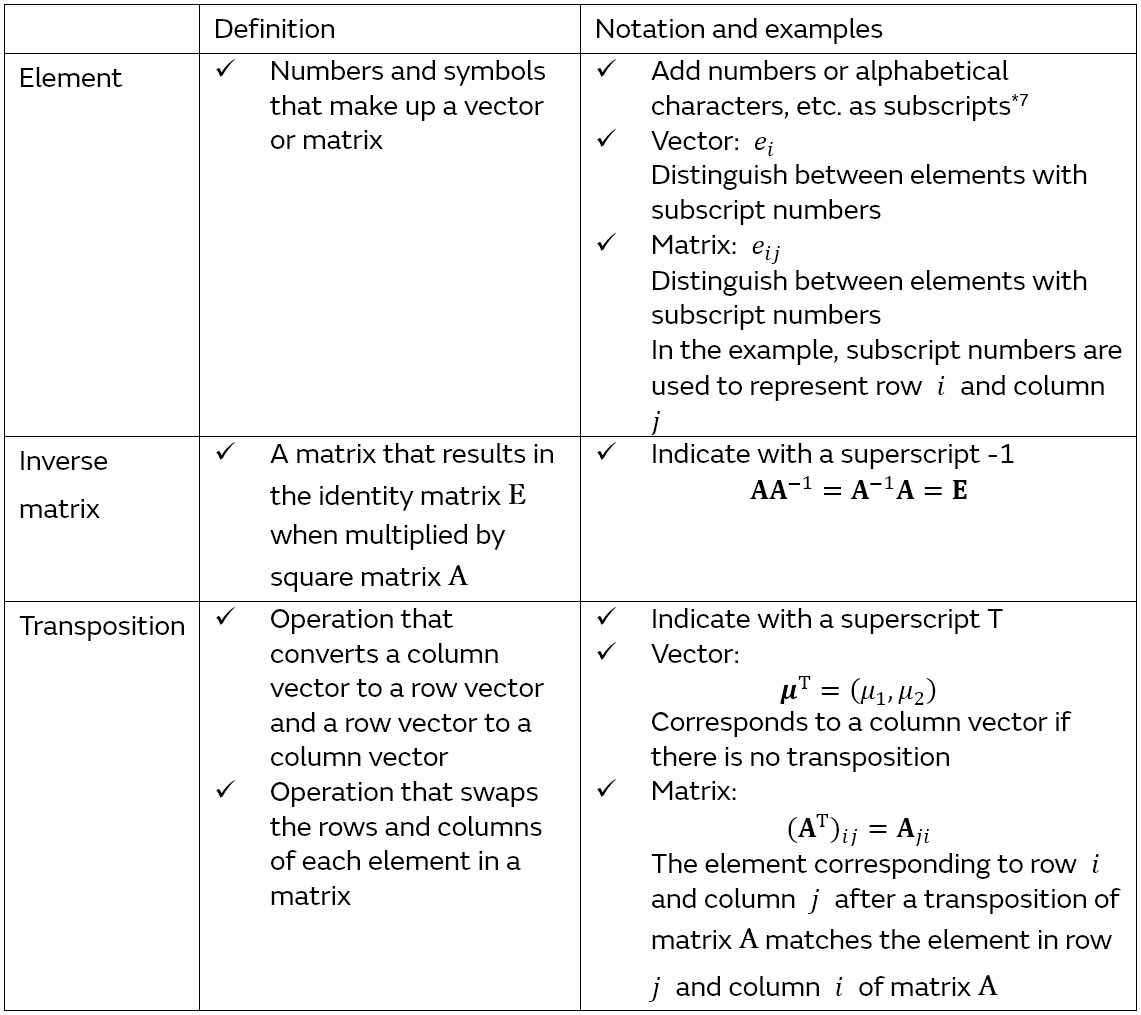
*7 Although subscript numbers and symbols are sometimes assigned for purposes other than notating the elements of vectors and matrices, they are defined in the text as needed.